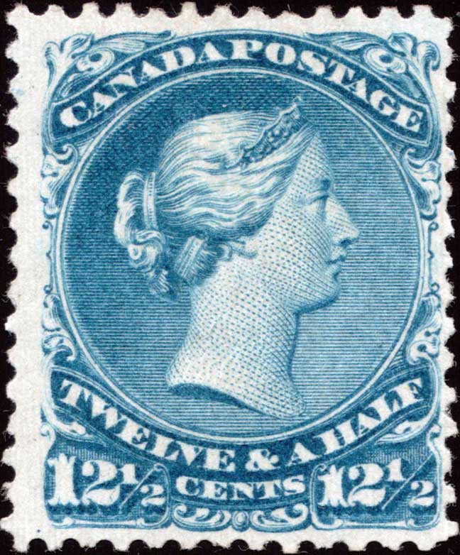
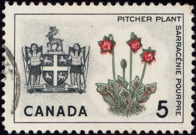
RE-ENTRY TERMS
One of the problems encountered in any specialty is in coming to some agreement or acceptance of certain definitions. Our particular area of philately, constant plate varieties on line-engraved stamps, specifically re-entries, is no exception. What follows are my definitions of some of our re-entry terms, as well as other numerous items that may be mistaken for re-entries, or may be related in some way. Please write if there are others you would like me to explain.
Return to Index Return to Listings Page
Shortcuts to Terms
Re-entry Fresh Entry Misplaced Entry Inverted Entry Foreign Entry Shifted Transfer Double Strike Double Print Retouch Short Entry Kiss Print Slip Print Dry Print Misregistration Ink Pull Transfer Roll Sidepoint Hairlines Cracked Plate Unerased Guidelines & Dots
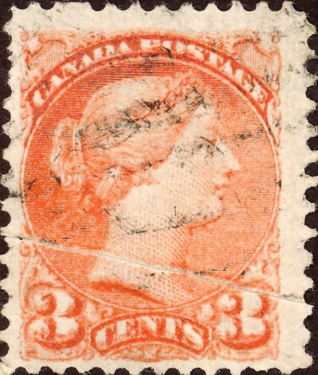
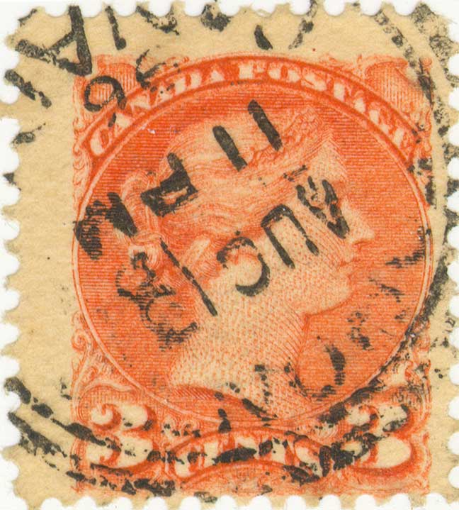
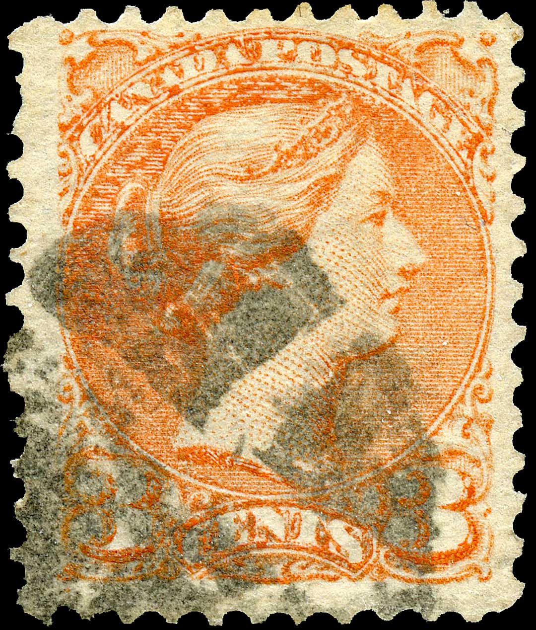
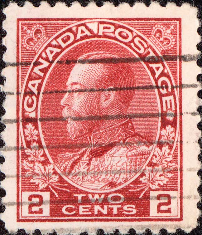
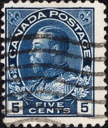
A re-entry is a constant plate variety occurring only on steel engraved stamps that shows portions of the design doubled or even tripled, one over the other. It occurs in the same position on every sheet printed from the plate on which the re-entry occurs. It was usually the result of the steel transfer roll being impressed more than once in approximately the same position on the plate from which the stamps were printed. This was done when the soft plates started to show wear after continuous usage. The unhardened steel plates were re-entered under the transfer roll to strengthen the weakened areas in the designs. Some plates, out of necessity, were re-entered more than once, resulting in several 'states.’ The original single steel plate for Scott #15, the 5¢ Beaver, for example, was re-entered ten times over its lifetime resulting in eleven different states. During the re-entering process, should the transfer roll not be aligned or registered precisely with the original entry, doubling of the design, or parts of it, will occur.
A second type of re-entry resulted when a faulty image on the plate was removed by hammering the plate from the back and burnishing the faulty impression off the surface (usually with charcoal) before rocking or rolling in the design in the correct position. In this process it sometimes happened that traces of the original impression remained and were reproduced in the printing. This is called a ‘fresh entry.’ (For more discussion, see below.)
Some time ago now, a member of the Canadian Re-entry Study Group of BNAPS wrote to ask me to explain what was meant by the term ‘fresh entry.’ Depending on the source you refer to, you may find one of two different definitions, or in some cases, even a combination of the two. I find this to be confusing, to say the least. Simply put, some sources, such as Stanley Gibbons, refer to a ‘fresh entry’ as ANY doubling of impression on the plate BEFORE that plate was put to press printing actual postage stamps. The key point in this definition is that a fresh entry could ONLY occur before the plate was actually used, and included even the simplest of re-entries. Other sources, such as Boggs' FOUNDATIONS OF PHILATELY, and Baxter's PRINTING POSTAGE STAMPS BY LINE ENGRAVING, require that a 'fresh entry' involves the [incomplete] removal of a faulty entry from the plate, which is then replaced by a new, or ‘fresh.’ entry being transferred into the smooth 'cleaned' area where the faulty entry once existed. Yet other sources, such as L.N. & M. Williams' FUNDAMENTALS OF PHILATELY, indicate that BOTH of the above aspects can be included in a definition of ‘fresh entry.’
My personal preference is the second of the above. That is, to be termed a 'fresh entry' a stamp must show evidence of a previous design that for some reason was 'erased' from the plate by burnishing, and a new, or ‘fresh,’ entry was applied in its place. This, to me, fulfills the intent of the term ‘fresh.’ I further propose that the use of the term 'fresh entry' for ALL those re-entries or 'corrections' that occurred BEFORE the plate was put into use printing stamps is somewhat erroneous, because a truly 'fresh' entry could theoretically occur at any time in the life of the plate.
Theoretically, but what about proof? Well, I believe that Horace Harrison provided evidence of such proof many years ago in his article on the Major Re-entry on the 15¢ Large Queen in MAPLE LEAVES [CPSGBI in April of 1962, Vol. 9, No. 4, Whole No. 76, p. 67, which later appeared word for word in H.E. 9 H.W. Duckworth's THE LARGE QUEEN STAMPS OF CANADA AND THEIR USE 1868-1872, p. 126. In his article, Harrison wrote that this Major Re-entry was "soon noticed" [AFTER the plate had been in use for a time] and was "entirely corrected by a fresh entry, thus making this re-entry one of the rarer plate varieties of the entire issue." He went on to say that although the plate position of the Major Re-entry is unknown, "it has been reported that there are indications of a fresh entry having been made at plate position #1 ON LATER PRINTINGS, and it may well be that this was the position of the re-entry."
So, we have a plate that had been used to print a number of sheets having a position removed by burnishing, and a new, or ‘fresh,’ entry laid down in its place. Is it proper to call this a ‘fresh entry,’ even though it occurred AFTER the plate was used? I certainly think so! What better term for it?
So, what DO we call 'ordinary' re-entries that were NOT the result of burnishing and replacement of defective entries, but probably just from strengthening weak entries, or slips of the transfer roll, that occurred on the first state of the plate before it was used to print stamps? Well, I believe that Peter Hurst [coined?] used the PERFECT term for these stamps way back in the 50's in his articles about the Major Re-entry on the 6¢ yellow brown Small Queen [TOPICS, May 1955, Whole No. 124, for example] when he referred to such re-entries as "INITIAL." [He also referred to this 6¢ Major as "initial" AND "latent", but I don't wish to confuse things even more here, so we'll leave the discussion of 'latent' entries for another time.]
'Initial re-entry' is, I believe, the perfect term to describe those re-entries that occurred on the plate before it was put into use, thus freeing up 'fresh entry' to be used solely to denote a stamp that shows evidence of a previous entry that was removed and replaced by another complete, new, 'fresh' entry, whether it occurred BEFORE or AFTER the plate was used to print stamps.
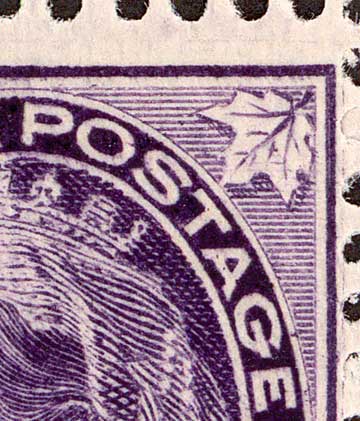
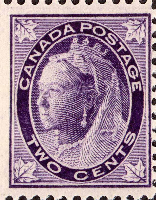
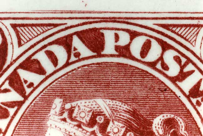
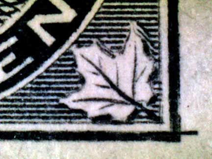
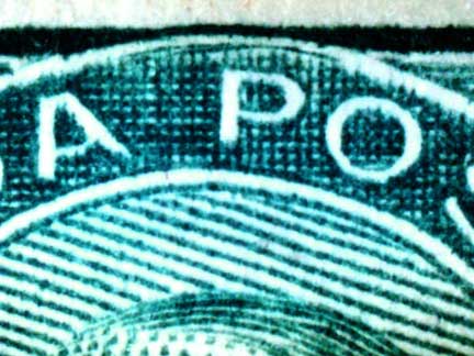
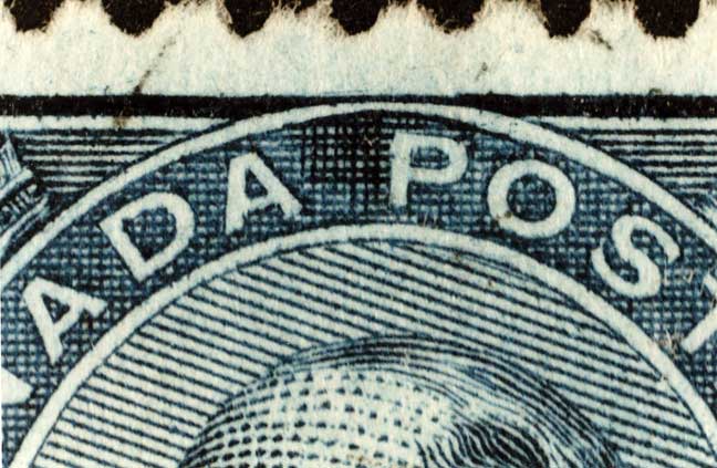
A perfect example of both a 'fresh entry' and an 'initial re-entry' existing side by side on a plate can be found on Plate 1, Left Pane of the 2¢ purple Maple Leaf issue, Scott #68, in Positions #1 & 2. Position #1 clearly shows evidence of a partially removed entry 0.75 mm above [and within] the final entry. The first impression was obviously misplaced too high, was burnished off [rather poorly], and a 'fresh' entry rocked in in the proper position 0.75 mm lower. [Almost identical-fresh entries are found below position #1 in positions #11 and #21, both of which were also wrongly entered 0.75 mm too high, burnished, and replaced by 'fresh' entries.] Position #2, however, shows a classic example of a typical Major Re-entry, showing two impressions, one on top of the other with one slightly askew, or twisted, but with no evidence whatsoever of any attempt to remove one of the impressions. The original entry was likely just a weak entry that needed strengthening by further rocking of the transfer roll, but the siderographer did not properly re-align the transfer roll, thus resulting in doubling of portions of the design [‘ADA POSTA’ and the L.R. corner, including the leaf] - the classic re-entry. As the above are all found on the original proof sheets, Position #2 is a perfect candidate for the term 'initial re-entry' while Position #1, and #11 & 21, show ‘fresh entries.’ (See scans below for examples of some of those just mentioned above.)
This, I hope, will alleviate some of the concern caused by having one term refer to two distinctly different types of varieties. As usual, your comments and opinions are always welcome.
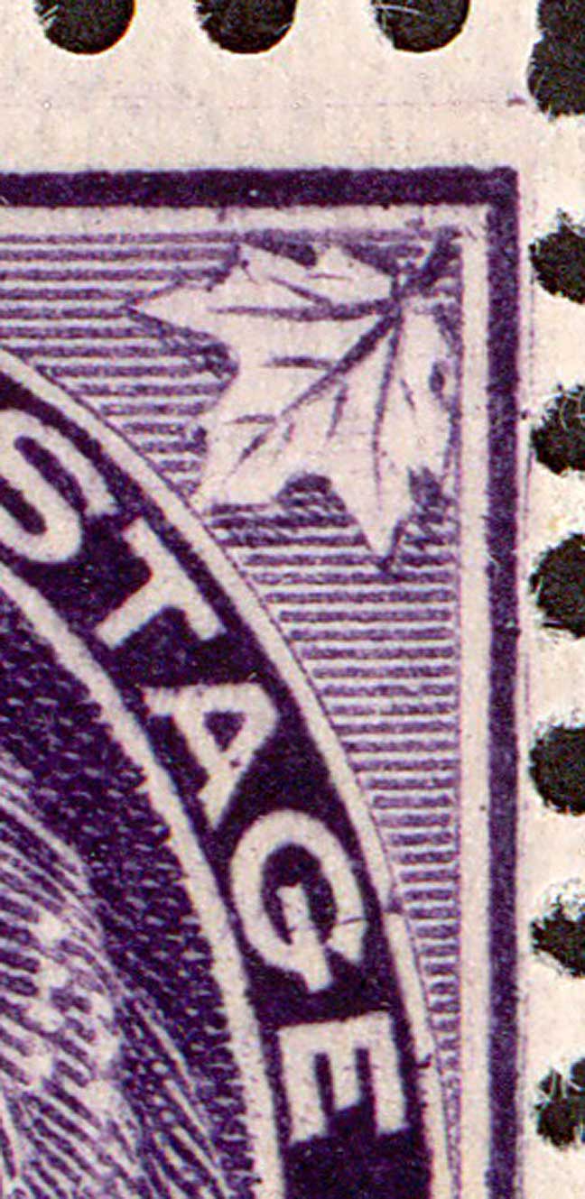
This is pp1 & 2 of Plate 1, Left Pane, showing the fresh entry in pp1 and major re-entry in pp2.
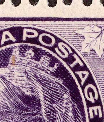
The misplaced entry can be seen clearly in the UR corner of pp1, although the upper frameline is extremely faint. (See pp11 below for a much clearer example.) The right stamp, pp2, shows nice doubling in POSTAGE.
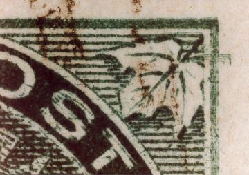
This is the fresh entry in pp11, showing the original misplaced entry throughout the design.
This is the UR corner of pp11, showing clearly the misplaced entry. The main design you see is the fresh entry.
For scans of the plate proof sheet examples, see HERE.
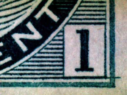
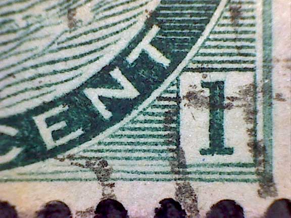
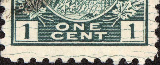
Some of the most incredible examples of the problems some siderographers ran into while laying down or repairing the steel printing plates are what we call MISPLACED ENTRIES. These occurred when the transfer roll was not set down on the plate in the proper position and portions of design were entered at least 0.5mm away from the proper position and sometimes as much as a whole half-stamp away. These misplaced entries are more than just misaligned transfer rolls, which cause re-entries; they are significantly out of position and can be corrected only by lifting the transfer roll up off of the plate and repositioning it. This type of misalignment was much more easily noted by the siderographer, and is likely the reason that so many misplaced entries appear to occur over only a fairly limited area, that is, a narrow band of misplaced design mixed in with the normal design. Once the transfer roll was placed on the plate and likely as soon as the rocking-in began, the misalignment was likely noticed and the roll immediately lifted and moved to its correct position. An error of this magnitude most certainly would have warranted the complete removal of the ‘damaged’ design from the plate, but this would halt production while that major repair was completed. Therefore, these misplaced entries seem to have been ignored by the siderographer, more often than taking the time to repair them. I came to this conclusion after examining all of the One Cent Numeral proof sheets in the Archives in Ottawa. The numerous examples shown below were not found on the proofs and therefore had to occur during later repairs. The fact that they were passed over and not corrected suggests to me that they did not have the time to shut down production while these entries were repaired. There is at least one example, however, where portions of the misplaced design were indeed removed from the margins, where they would have been most noticeable. (See the 2¢ Numeral “hook on the 2” example.) The most well-known example of a misplaced entry on a Canadian stamp would have to be the Double Epaulettes variety on the 10¢ Decimal Issue. More than a half-stamp away, this variety has been known and catalogued for many, many years. Following are some examples of amazing misplaced entries.
This is the famous Double Epaulettes misplaced entry, showing the remnants of the lettering band just above the shoulders of Prince Albert. The ‘epaulettes’ are actually parts of the letters of CANADA POSTAGE. Other marks can be seen in the white portrait oval and in the spandrel below the ‘T’ of TEN. Also note the upper left corner of the top frameline extending out into the margin at left-centre. It’s amazing how many collectors do not even realize this is a misplaced entry, but it is one of Canada’s best!
Both of these examples of One Cent Numerals are misplaced out into the right margins by 0.5 mm. The left one is 1.0 mm lower than it should be, while the one on the right is 4.3 mm lower. These two are very special to me, as they were my first experiences with misplaced entries. The left one was initially found by Dr. Gray Scrimgeour, who had two copies and very kindly gave me one of them. The one on the right was originally reported by Dr. Warren Bosch in my early Canadian Re-entry Study Group of BNAPS days, and it eventually ended up in my collection as well.

This one is not far enough off to be actually considered misplaced, but I included it here to show that the above two examples were not the only ones that occurred. I believe this one very likely happened on the same plate during the same repair as the above two.
Do you see the UPPER frameline and the stem of the upper right maple leaf in the lower right numeral box? Yes, this shows a design that is misplaced 5.6 mm too low! A bit of the curved outline of the portrait oval is visible extending down from the bottom frameline to the lower left of the numeral box.
At the risk of getting silly here, I can almost imagine a bleery-eyed siderographer on a Monday morning, following a long night of partying and drinking, and who forgot his glasses at home, trying his very best to focus his eyes to align the transfer roll to re-enter this position on the plate. As you can see, he had quite a time of it! The upper right corner shows evidence of at least FIVE different attempts at getting the transfer roll into the correct position! Note all of the stems of the maple leaf scattered all over the place. And to top it off, there is a slipped retouch extending outwards from the top right vertical frameline. I love this stamp!
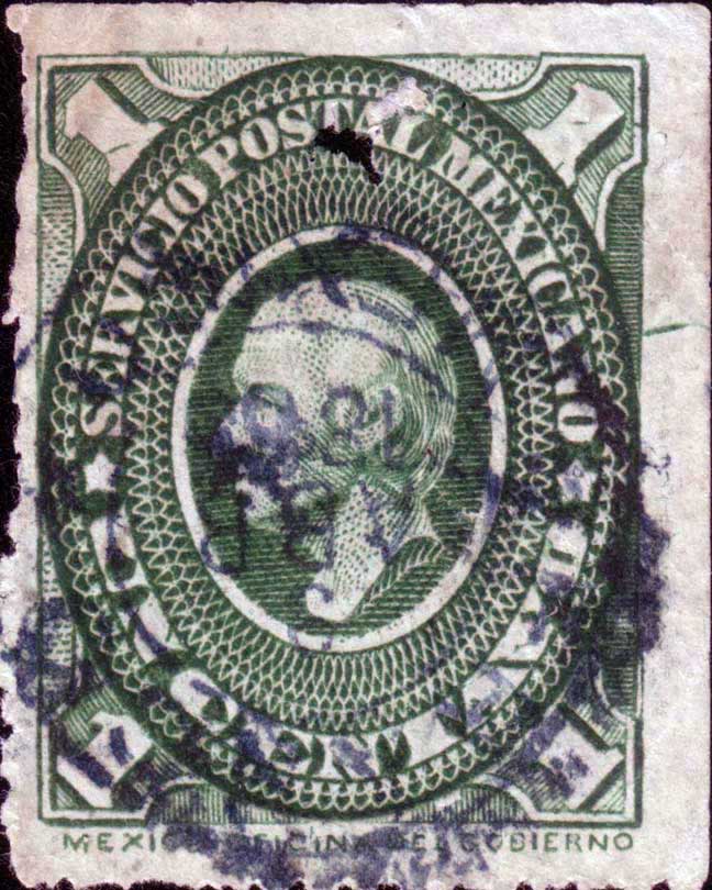
Here is a lovely double misplaced entry on a Mexican Airmail stamp. Note the doubling of the upper left spandrel and portrait oval lines. Then look to the right and you will find another upper left spandrel and portrait oval lines cutting into the cap.
Talk about misplaced! Here we have a Mexican revenue where there is evidence of a second design that has been rotated sideways a full 90 degrees. It is possible this was the first entry on the plate, when the siderographer realized he had the wrong orientation of the roller, who then turned it to the correct alignment.
Randall Van Someren discovered the very first example of an INVERTED ENTRY on a Canadian stamp!
See the scans below that show a completely upside down entry made on top of a normal entry on the plate!
An INCREDIBLE find!

^ Courtesy of Randall van Someren >
A foreign entry or foreign transfer is one of the most ‘exotic’ types of transfer roll mishaps. They occurred when the transfer roll for one denomination was used to enter the design of a different denomination on top of an image already on the plate. This happened for one of three reasons: The first, and simplest, was that the wrong transfer roll was picked up and used while carrying out a repair to the plate. This will be shown below with a gorgeous U.S. example. The second because transfer rolls often contained the designs of more than one value or denomination on its circumference. If the roll was rotated between impressions, it was possible for a different design to be rocked in. The third, and perhaps more complicated reason, came about when the transfer roll was being rocked-in correctly, but the siderographer (perhaps an inexperienced apprentice) accidentally over-rocked the impression, and portions of the design on the roll next to it were accidentally impressed into the plate position above or below the one being repaired. This was long a point of heated discussion (argument?) amongst collectors, until it was indeed proven that transfer rolls did actually contain multiple impressions of more than one denomination.
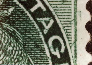
This is the stamp that Boggs referred to as “The Most Remarkable Variety of Canadian Stamps.” It is the famed 5¢ on 6¢ Small Queen. It is now generally accepted that this incredible variety occurred when the 6¢ transfer roll was over-rocked while a repair to the B Pane was being carried out. The transfer roll also carried the design of the 5¢ value and the over-rocking resulted in a band of the 5¢ design being impressed into the upper portion of the 6¢ design in position #25. This band of detail can be seen right across the entire width of the design, showing in the ‘AN’ of CANADA on the left, through the top of the hair (remnants of letters from the upper band), an arc through the tiara, and into the ‘AG’ of POSTAGE on the right. Details to look for are the ‘ball’ of the UL corner of the 5¢ SQ in the margin just touching the UL ornament, and the myriad of tiny squares of the UR spandrel of the 5¢ in and below the ‘AG.’ Since the discovery of this “Remarkable Variety,” once thought to be unique among Canadian varieties, several more plate positions have been found to show the same, but slightly different, types of 5¢ on 6¢, and a half dozen examples of much fainter ones, known as the “lesser 5 on 6’s,” have been documented. See my separate page devoted to all of these HERE.
The 5¢ on 6¢ SQ was the only known foreign entry on a Canadian stamp, until the 10¢ on 1¢ Numeral was discovered on the proof sheet in Ottawa in 1990 by yours truly. Above you can see the band of the 10¢ design across the entire width of the 1¢ design at the level of the Queen’s neck. As you can see, the 10¢ design was not aligned on the transfer roll with the 1¢ design, and the 10¢ band extends out into the margin on the right. A curved portion of the ‘10’ can be seen in the white oval directly above the right numeral box. Elements of the 10¢ design can also be seen crossing into the necklace just below the Monarch’s ear, and on the left, inner and outer horizontal framelines are clearly evident. Since my discovery of this amazing variety, at least two more plate positions of very similar items have been documented. Please see my web pages devoted solely to this foreign transfer HERE, HERE and HERE. There is more detail to come.
Not to be outdone by the 10¢ on 1¢ Numeral, Dr. Michael Sendbuehler of Ottawa discovered a similar type of foreign entry on the 5¢ Numeral, but in this case the other value is not yet certain. However, it has to be one of the values having four distinct fine lines forming the outer framelines. The inner and outer framelines, as well as the stems of the upper corner maple leaves, can be seen crossing the 5¢ design through the ‘N’ of CANADA and the ‘A’ of POSTAGE. For more, see my web page HERE. (This is still #1 on my want list!)
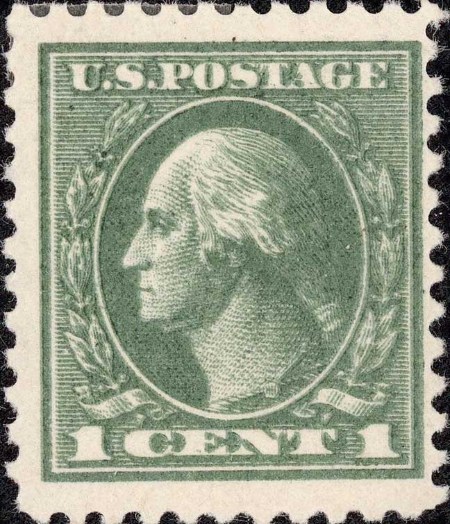
And here is the famed 5¢ design on the 2¢ Washington of 1917, Scott #467. This was a case of the 5¢ transfer roll being used to re-enter three positions on two 2¢ panes of the same plate: 7942 UL 74, 7942 UL 84, and 7942 LR 18. These errors of colour (as often referred to by U.S. collectors) can also be found in imperforate format, Scott #485. (The example shown here is from Plate 7942 LR 18, and is the centre stamp in a block of 9.) Interestingly, it is the complete 5¢ design we can see when we look at this stamp, with only tiny remnants of the original 2¢ design remaining. For more on these stamps, see my web page HERE.
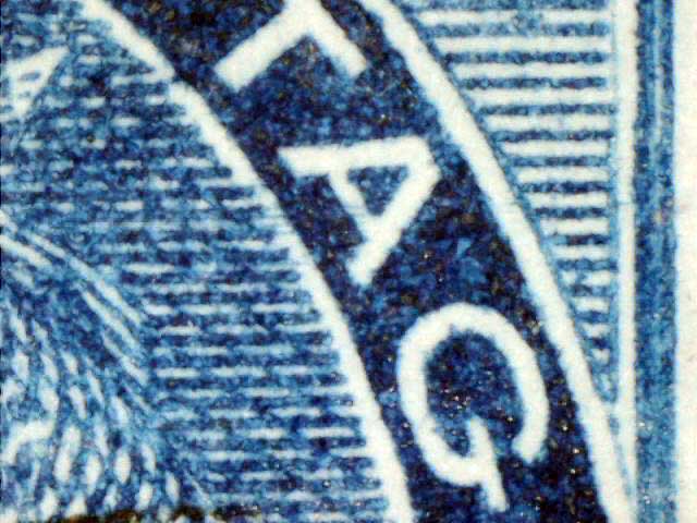
A double strike refers to doubling on a stamp printed by typography, but shows doubling similar to a re-entry. However, it is most important to remember that re-entries ONLY occurred on line-engraved stamps, so this doubling is NOT the result of re-entry, but a completely different process! See the first illustration below...
^ Courtesy of Peter Hausknecht >
^ Courtesy of Peter Hausknecht >
Now I would like to tackle another term that is often misunderstood in re-entry circles - the shifted transfer.
Many collectors believe that the term shifted transfer is synonymous with re-entry. However, this is not an accurate assumption! The classic re-entry involves the reapplication of the transfer roll to the plate to strengthen a weakened or worn image. A shifted transfer, however, does not involve the reapplication of the transfer roll, but occurs as the design is being rocked in, or transferred, to the plate. This could occur during the actual initial manufacture of the plate, or afterwards during a repair, or re-entry.
The basic concept of a shifted transfer involves the plasticity of the soft steel plate under the enormous pressure of the transfer roll in the transfer press. This pressure could range from 8 to 35 tons at the point of contact, depending on the particular press. Under such pressure, the surface of the steel plate actually ‘flows’ away from the transfer roll in a minute ‘wave’ as the stamp design is being rocked in. The experience and skill of the siderographer allowed him to apply just the right amount of pressure and at the proper speed in order for this ‘wave’ to cause a negligible amount of distortion of the plate’s surface. The plasticity of the steel at this point usually caused the wave of metal to flatten itself out at the end of each pass of the roll, with no discernible effect on the design. However, despite the skill of the siderographer, sometimes too much pressure was applied too quickly, with the result being a shifted transfer. I shall explain. ... I’m sure we are all aware that it takes many, many passes of the transfer roll back and forth on the plate to enter a design to its proper depth. If the full length of the design has been rocked in and then too much pressure applied, or the roll is rocked too quickly, this tiny ‘wave’ of metal that is pushed ahead of the roll will carry with it a portion of the design that has already been entered. If the pressure or speed has been too great, this ‘wave’ of stretched metal cannot flow back to its proper position, and what we have is the top or bottom, or left side or right side of the design showing an image that is stretched slightly longer or wider than it should be. On subsequent passes of the roll, the design now no longer perfectly coincides with the lines of the former impression, and a slight doubling of the design appears. This doubling always occurs at one extremity of the design, either the top or bottom of a vertical design, or the left or right of a horizontal design. Should this increased pressure and/or speed occur in both directions of the rocking, both ends of the design may show evidence of this ‘doubling,’ but the doubling will be in opposite directions!
Obviously, it can be extremely difficult, or even impossible, to tell a shifted transfer from a true re-entry, and indeed, many collectors do not even try to distinguish between the two, electing instead to call them all re-entries. An example of one such stamp is seen above. Here we have a 5¢ Medallion, Scott #199, with slight doubling at the top of the design. It certainly looks like a re-entry, but I suspect it, and others I have like it, may instead be a shifted transfer. An almost certain shifted transfer can be seen below. Here we have the so-called Major Re-entry on the 7¢ Airmail stamp of the1946 Peace Issue, C9. Both the left and right edges of the design show doubling, but if you look carefully, you will notice that the ‘doubling’ at each end is in opposite directions!
The C9 shown above is from Plate 2, Lower Left Pane, Position #10, BUT this issue is absolutely rife with ‘re-entries,’ most of which I suspect are in reality shifted transfers! I have literally dozens of different C9’s, showing all sorts of combinations of doubling - some weaker, some stronger. I have doubling on the left side & lower right side; upper right side; left side; right side; upper left & lower right; lower left side; upper left side; upper right & lower left; etc., etc., etc. And many of these are in pairs, with each stamp showing doubling in different portions! At first, this might sound like a re-entry nut’s dream, BUT with the above stamp [and several others like it] showing doubling at both ends of the design in opposite directions, I would suggest that most, if not all, of the so-called re-entries on C9 are actually shifted transfers instead. This is not at all to suggest that there is anything wrong with collecting these stamps and their lovely doubling! We must, however, recognize that not all doubling denotes the classic re-entry!
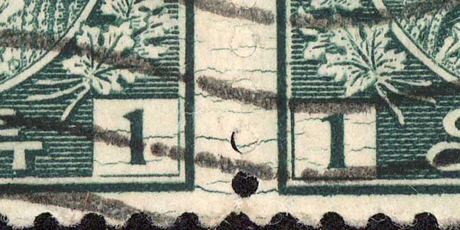
The most important thing to remember about retouches is that they were done by hand, unlike re-entries that must involve the use of the transfer roll on the plate. Some areas of some stamp designs tended to wear faster then others ... framelines would wear down and become thinner and thinner; the fine lines of numeral boxes (especially on the Numerals and Edwards) would sometimes start to ‘disappear’ due to wear, and so forth. Even some inks were harsher on the steel plates than other inks, and cause excessive wear on the steel designs. Re-entering the individual designs on a plate of 100, 200 or even 400 stamp images to strengthen worn images, was an extremely labour-intensive, time-consuming process, and one which would put the plate out of use for some time. If the wear was not overly extensive and just affected a few particular areas or lines of the design, it would often be much more cost and time-effective to have the engraver strengthen the lines by hand, using an engraving tool, usually a burin. Unfortunately, even the most skilled engraver could not duplicate the fine lines of the transfer roll precisely enough, and irregularities often occurred. Different amounts of pressure on the burin while trying to strengthen a frameline would often result in varying depths of the strengthened line, appearing as wider, or narrower, or wavy portions of the intended line. The first of these, wider, was the usual result, and retouched framelines or numeral box lines very often appeared thicker and heavier than the surrounding areas. Sometimes the engraver’s hand might slip, and the burin would scoot off at a tangent, or beyond the intended boundary. Many, many examples exist of all of these types of retouches.
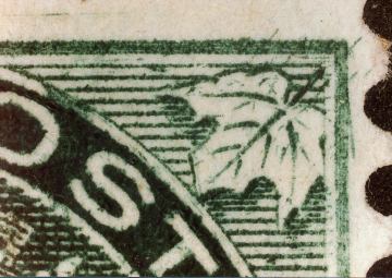
This is a lovely slipped retouch from pp37 on the 2¢ Decimal Issue, Sc. #20.
Here are two retouches where the engraver slipped and his tool went further than it should have. These are called slipped retouches.
Here there is a double-line retouch of the bottom frameline, leaving the centre of the frameline empty. Note the 'wavy' upper line of the retouch. Courtesy of Dave Freeman

These are two examples of how easily most retouches can be detected - the retouched lines stand out from the transfer roll engraved lines.
This is the “Portcullis” Retouch from pp4L48, which is quite dramatic and takes its name from the reinforced gates of medieval castles.
Sometimes retouches occur concurrently with re-entries, such as these two 5¢ Edwards.
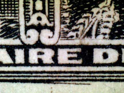
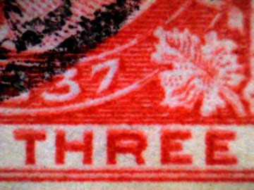
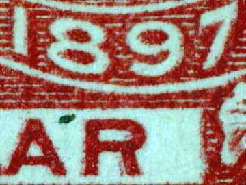
There are actually three slipped retouches along the bottom frameline of the well-known ½¢ Quebec Tercentenary Major Re-entry.
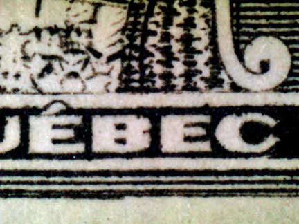
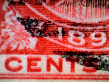
The 1¢ Quebec Tercentenary has a great many retouches, mostly on the background horizontal lines. Notice how they stand out.
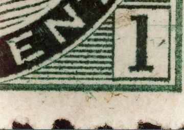
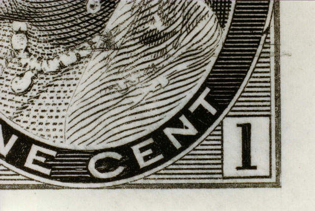
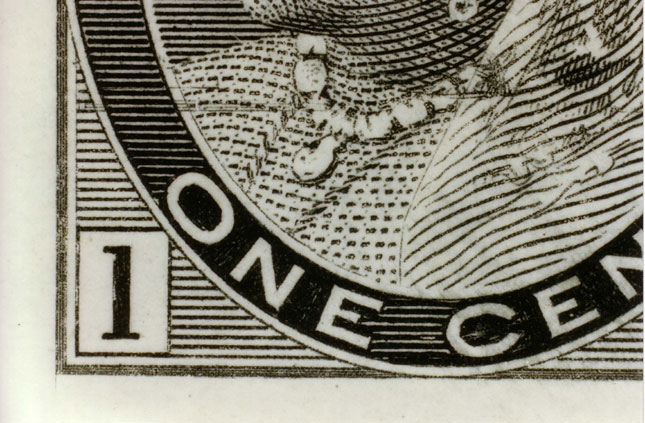
A short entry (also known as short transfer) occurs when the transfer roll impression is not fully entered onto the plate. This could be due to an uneven plate surface, or unequal pressure being applied during the rocking-in. They resemble plate wear, but can be distinguished by the fact that the rest of the impression is deep and clear as it should be. If the overall impression was worn, we could simply attribute these to normal plate wear. Examples of short entries have been seen on proof sheets.
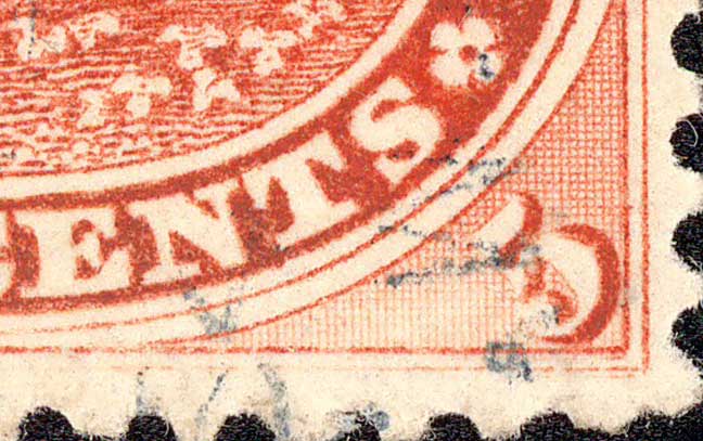
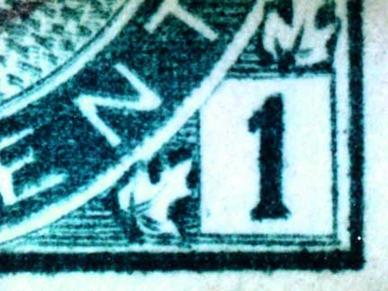
Note the missing design in the spandrel to the left of the 5. (The corner also shows a re-entry.)
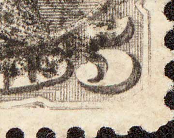
Here the lower right corner of the design is missing.
Here you can see the sharp impression of the left stamp, while the upper left corner of the right stamp is barely visible.
Here the outer framelines on the right are missing, due to a short transfer.
This is a catalogued short entry, Un.#28ii, “no outer frameline at value tablet.” While the same type of variety can be found with the frameline missing on the right value tablet too, this is the one that is suspected to be from position 67 (Duckworth p.120).
Kiss prints occur when the stamp paper accidentally slaps back on to the plate, possibly picking up residual ink, or badly smearing the ink just printed. Or, when the next sheet printed lands on top of the lower sheet, smearing to still damp ink Of course, these are not constant. Note the overall smearing.
Courtesy of Peter Hellsten
Here is an obvious kiss, with ink markings all over the stamp.
Also known as slurred prints, slip prints are often confused with re-entries However, they are not constant plate varieties, but printing varieties. That is, the doubling effect is not on the engraved plate, but occurred while the stamps were being printed. To create a slip print, (sometimes called a ‘slurred’ print), the paper was somehow shifted slightly while the paper was in contact with the plate, either touching the plate just before it was properly positioned, or pulled from the plate a little too quickly before the ink had properly separated from the plate on to the paper, drawing the ink away slightly in one direction, giving it a doubled effect. This is a very common effect found on pretty well all of the early engraved stamps. (They are often also wrongly identified as double prints by those not experienced with printing varieties.) Having said all that, I have seen numerous examples that appear to be virtually identical, which is odd considering they are printing varieties. This leads me to believe that they might have something to do with the adjustment of the printing press itself. Perhaps the timing was off a little on the feeding of the sheets, or their removal from the plate surface? This might have resulted in a number of sheets, perhaps even a large number, all being printed with this effect, before it was noticed and an adjustment to the press settings was made. Whatever the cause, they are easily distinguished from true double prints and re-entries by the blurred effect of the doubling. A true double print is the result of a sheet going through the printing process a second time, receiving a second, fully-inked impression - not a slightly fainter blurry one, as evidenced by slip prints; while a true re-entry exhibits additional sharply engraved lines, resulting from a reapplication of the transfer roll on to the plate, which does not coincide exactly with the previous engraving. With a true double print, all of the subjects on the sheet would be printed twice, not just a single stamp; whereas a re-entry occurs on a specific, single plate position.

Shown above is an extreme example of a slip print; most are not nearly this strong. Many dealers would offer this as a re-entry, but note the blurriness of the design. This is the sure sign of a slip print, where the paper slipped and blurred the ink. Notice that I left the tiny piece of the stamp below attached, as it too shows the same blurriness.
There are many Jubilees that are described as re-entries, but are actually slip prints. Note the blurriness of the ‘doubling.’
Here the entire design appears to be doubled, but is much too blurry; the obvious marks of a slip print.
Here is a portion of a $1 Jubilee with overall doubling, due to a slip print.
This is a rather extreme example of a slip print, accompanied by a natural paper crease.
Another extreme example of a slip print...It’s amazing the number of times I see such items for sale as re-entries.
What we have here is yet another type of inking variety that is very often mistaken for a re-entry. This is the dry print, wherein some of the ink remained stuck in the recesses of the engraved plate, instead of being transferred to the paper, leaving unprinted, or white areas, around portions of the design. There were at least two possible reasons for this. This was very common on earlier printings where the paper was dampened before being put to press. The damp paper was easier for the ink to adhere to, thus allowing the paper to pick up all of the ink on the plate. The pressure of the print bed sandwiching the paper between the bed and the printing plate would force the dampened paper into the recesses of the plate, enabling the paper to pick up the full amount of ink. The stacks of damp paper would sometimes sit too long and begin to dry out, thus reducing the ability of the pressure on the paper into the engraved lines and affecting the adherence of the ink. The areas most commonly affected were the deep recesses around the lettering, which would, of course, hold the most ink. Old ink left in the engraved lines could also dry out, causing these areas to become more shallow. If the plate was not thoroughly cleaned between printings, these dry areas would gradually build up, and soon there would be no open engraved areas to pick up fresh, wet ink, causing white gaps (due to lack of ink) in the printing. It is this latter effect that is likely responsible for these white areas on later printings when the paper was no longer dampened. Unfortunately, these white areas around lettering are very often mistaken for doubling, even by experienced dealers. (I once drove a hundred miles to visit a dealer who told me he had a whole envelope full of re-entries, but forgot to bring them to the stamp show. When I got there, I discovered to my dismay, that every single stamp in the large envelope was a dry print and not a re-entry.) It is very common to see stamps in dealer’s stocks, as well as on eBay, identified as re-entries that are actually only dry prints. Keep in mind that re-entries show extra lines of colour, not simply white areas of missing ink.
This 2¢ SQ is a good illustration of a dry print. Note all of the white areas in and around CANADA POSTAGE, as well as some areas around both 2’s and CENTS. These white areas are very often mistaken for doubling, but as you can see if you look closely, they are simply areas of missing ink. Courtesy of Garfield Portch
This 3¢ SQ is one of the driest prints of a dry print that I have ever seen.
Courtesy of John Phillips
This is a fairly severe example of a dry print. Most do not show such large areas of white.
This a more common example, showing areas of missing ink next to the ‘C’ & ‘N’ of CANADA and in the lower left ‘8.’
A more ‘modern’ type of variety that is often confused with re-entries is the misregistration of colours in the printing of a stamp (also known as ‘colour shifts.’ Re-entries occur only on engraved issues, so if a stamp appears to have some doubling, but is printed by photogravure or lithography, it cannot be a re-entry. When the different colours on a multi-coloured stamp are not correctly aligned, or registered, you sometimes get the effect of doubling. It is not a double print, either. This would also happen over the entire sheet. Re-entries occur only on specific positions on the plate, and while some re-entries may appear extremely similar, each one is actually unique to a particular spot on the plate.
Normal
Slight misregistration causing what appears to be doubling of the Queen’s profile. (Courtesy of Michel Houde)
Much stronger misregistration of the colours.
This is another printing variety, not a plate variety, and is also often referred to as a double impression . While some re-entries are SO strong and extensive that they appear to have been printed twice (see the 5d George VI New Guinea), true double prints are quite a different matter, and in most cases, quite rare. A true double print is just that - printed twice, from a fully inked plate, receiving two complete, full impressions caused by passing through the printing press twice. It is obvious that this would result in the full sheet of 100 or 200 or even 400 impressions on the sheet being printed completely a second time. And the chances are slim that the paper would go through in precisely the same position and so both impressions should be visible. A complete re-entry, such as the aforementioned 5d New Guinea, would occur in only a single position on the plate. Double prints, or double impressions, are more often found on stamps printed by lithography or typography, than on intaglio, or engraved stamps. The 6¢ QEII postal stationery envelopes seen directly below, is a good example of typographic printing. In both lithography and typography (relief printing), the lines you see on the plate are the lines that pick up the ink. In the case of the 6¢ stamps shown below, they most likely did not go through the press two or more complete times, but may have occurred during the initial set-up of the press. The slightly fainter additional images makes me think they were adjusting the pressure on the printing bed and used the same stock over and over, rather than wasting new stock. These may have been ‘test’ pieces and were likely destined for the waste bin, but they accidentally made it out into the public’s hands.
This is a Double Print of Canada Sc. #U91, 6¢ Black on a postal stationery envelope.
This example of U90 shows four different impressions, three of which are weaker than the first. Courtesy of Barrie Atkinson

This example of U90 shows two different impressions, fairly widely spaced. Courtesy of Barrie Atkinson
This is the red double-printed Canada Sc. #427ii.

This is an Italian commemorative showing the purple colour double printed.
This is a Double Print on U.S. Sc. #498d.
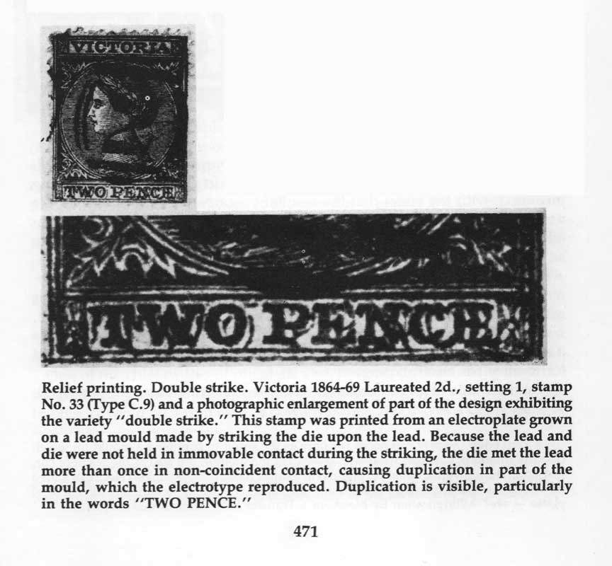
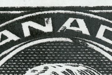
A Double Strike is another variety that is most often mistaken for a re-entry! While it DOES involve doubling of a portion of the design, it did not occur from the misplacement of the transfer roll on the plate. Instead, it goes back yo the early days of plate-making when cliches were grown one at a time from an electroplate on a lead mould made by striking the die upon the lead. As the image below (taken from FUNDAMENTALS OF PHILATELY, by L.N. Williams, APS Revised Edition 1990) says, “Because the lead and die were not held in immovable contact during the striking, the die met the lead more than once in non-coincident contact, causing duplication in part of the mould, which the electrotype reproduced.”
FUNDAMENTALS OF PHILATELY, by L.N. Williams, APS Revised Edition 1990
Ink pull is a term I use for stamps that exhibit streaks, blobs or short lines of ink all in the same direction. They are likely the result of ink that is a little too thin, or fluid, and when the paper is pulled from the plate, this excess of ink is pulled away from the surface of the paper. These extra blobs of ink are often mistaken for doubling by inexperienced collectors and dealers.
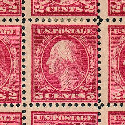
Here we see bits of colour pulled all in the same direction, the 2¢ towards the upper left, while the 5¢ is to the upper right.
^
This example of simple ink pulls is presently on sale on eBay (Dec. 29, 2006) described as THE MAJOR RE-ENTRY, Scott #104vii. Not only that, but it has received 32 BIDS so far, and is sitting at $1305.00 USD!!! Needless to say, the seller had better be prepared to give a quick refund, as it is not even a re-entry, let alone the famous Major on the 1¢ Admiral! Unbelievable! ... Not only that the seller would list it as such, but that the 5 different bidders would bid it up from the opening $49.99. (The above stamp eventually sold for $1425.USD. I have written to both the winner and underbidder to explain what they were really bidding on.)
Here is another 2¢ Admiral with pulled ink streaks.
(Coming soon)
Hairlines are usually the result of damage to the plate. Almost all of the stamps we know to have true hairlines (many Admirals, Edwards, 1c Quebec Tercentenary, etc.) are a result of the steel printing plates cracking while being bent to fit the circular rotary presses. These cracks naturally picked up ink which printed along with the stamp designs. Some can be quite spectacular. Even flat plates sometimes became cracked, some from the constant stress on the steel, others from damage caused by heavy objects being dropped on the plates. Printing houses were busy, noisy places, and all sorts of things could happen accidentally to the plates, if the pressmen were not careful. Other hairline-type markings could be caused by scratches on the plate; improper wiping of the plate surface before printing (usually finished up with the bare hand); and yes, even actual hairs or threads falling on the plates and getting stuck in the ink. I have an Admiral stamp around here somewhere with an actual tiny hair stuck in the ink. Of course, if this hair falls off after the ink dries, or is pulled off from the friction of the sheets of paper on top, it would leave a tiny blank or white line, which is actually the opposite of what we think of when we think of hairlines ... Lines of colour.
This is a beautiful example of strong hairlines on a 1¢ Admiral. Below is a copy of the left stamp showing lines below the design.
And another 1¢ Admiral showing hairlines in the top margin.
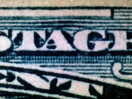
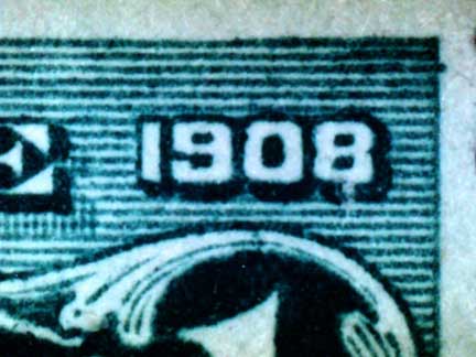
These are two different examples of hairlines on the 1¢ Quebec Tercentenary, as listed in Unitrade as #97i.
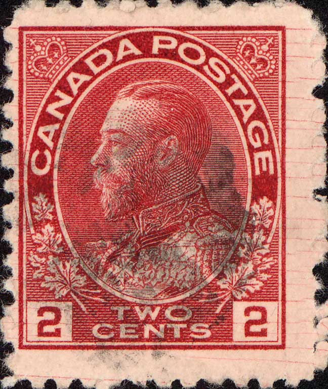
This is a lovely example on the 2¢ Admiral.
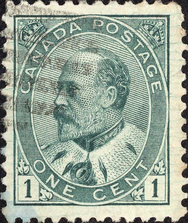
The 1¢ Edward.
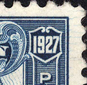
The 1927 Map of Canada, Sc. #145.
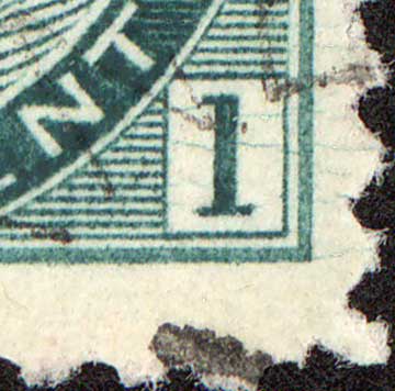
The 1¢ Numeral, Sc. #75.
Return to Index Return to Listings Page